iOS 18 Dark Icons
After years of strict non-icon-customization policy, Apple finally allowed users to have customizable icons on their home screens with the release of iOS 18 on 16 September 2024.
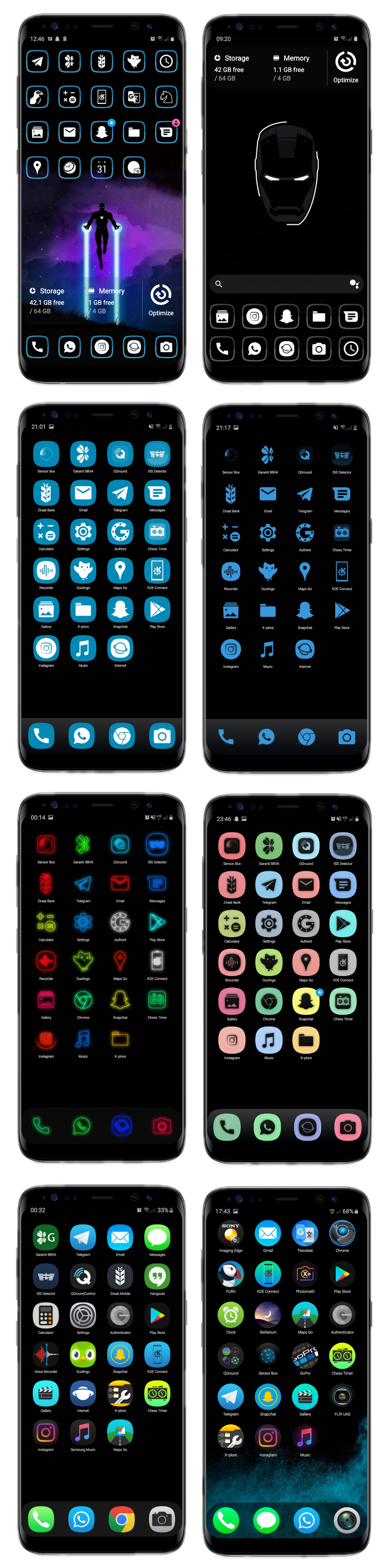
However, I was 5 years ahead of them 😎 In 2019, I made an icon theme for my Android and published the “Veniverse Icon Pack” on Google Play:
As you can see, no one knocked off the other’s design. I just got inspired by them first, then they (maybe) got inspired by me 🙃
It was removed from Google Play a couple of years ago due to not being updated according to some new policy, but I still have proof of the time I was using this icon pack. Check the date of this tweet if you don’t take my word for it 🙃
Why using iOS-like icons on Android?
Kudos to the biggest design company on Earth, Apple. I must admit that the iPhone’s UI is more elegant and proper than any Android. If I could develop apps for iPhones on my Linux desktop without requiring a Mac to build, I’d use them.
My Android phone’s journey to its current look evolved over time. So much so that now it doesn’t even look like iOS anymore; it looks like the Nokia Symbian S60 icons before they started switching to Belle, an iPhone 1-like design.
Even this blog uses those 3D icons now. I should add: all these files displayed on this website belong to Nokia (or HMD now) and are not commercially used by me anywhere else 🙃 This website’s design is dedicated to honoring Nokia’s iconic designs and the unnamed designers whose names I couldn’t find in the iF Design Awards catalogs.
AFAIK, Nokia’s Belle icons are the first ones that used the shape “squircle” before Samsung made it default for One UI. The shape squircle is just a more rounded square compared to Apple’s rounded square icons.
Before I got bored with the Veniverse icons, I was using them with the squircle shape since it fits my Samsung device’s default:
Nokia S60 Icons
Anyway, I always admired the designs those Finnish guys made at that time. I even used my old E51, N82, N95; Nokia Symbian S60 N Series devices with the default icon themes.
I even tried this nostalgic Nokia icon pack on the Google Play Store. But the icon coverage and the quality of the icons did not satisfy.
Then I tried to look up raw material I could find on the internet to make an icon pack. I was hopeless about even finding high-res .png files, but I was lucky. This guy on DeviantArt shared extracted E51 icons, directly from its firmware, using ancient tools like nfestd_0.3, siscontents1751, and svgb2svg.
I was even more impressed with their vector design approach at the time. Even now, our mobile devices are filled with .pngs and Google’s .webp files. And I was excited about hacking a legacy firmware 🙃
Firmware Hacking
I was able to find the firmware of the Nokia N96 on the Internet Archive. Then the challenges began.
After extracting the files and taking a quick look, I realized that the icons are stored in .mif files. I booted into Windows and was able to see the contents of these files with an old program that opened .sisx files. This format is for Nokia’s app package manager. We used them to install games and software on Symbian S60 devices, wayyy back when I was in high school.
There were \(350\) .mif files in the firmware, and after opening them one by one, I realized that a .mif file can contain multiple svgb icons. After a little struggle, I decided to write extraction code instead of opening them one by one.
I found a very small .mif file with two small icons inside. I extracted these two with the sisx package manager, then inspected their hex together with the .mif file. After learning about the structure, I wrote a simple Python script to extract the .svgb files:
import os
def extract_svgb_from_mif(mif_path, output_dir):
    if not os.path.exists(output_dir):
        os.makedirs(output_dir)
    with open(mif_path, 'rb') as mif_file:
        data = mif_file.read()
    svgb_signature = b'svgb'
    count = 1
    pos = 0

    while True:
        svgb_start = data.find(svgb_signature, pos)
        if svgb_start == -1:
            break

        print(f"Found SVGB signature at position {svgb_start} in {mif_path}")

        svgb_end = data.find(svgb_signature, svgb_start + len(svgb_signature))
        if svgb_end == -1:
            svgb_end = len(data)
        print(f"Data around SVGB start (hex): {data[svgb_start:svgb_start + 20].hex()}")
        svgb_data = data[svgb_start:svgb_end]
        svgb_filename = os.path.join(output_dir, f"{os.path.basename(mif_path)}_output_{count}.svgb")
        with open(svgb_filename, 'wb') as svgb_file:
            svgb_file.write(svgb_data)
        print(f"Extracted: {svgb_filename}")
        pos = svgb_end
        count += 1
    if count == 1:
        print(f"No SVGB files found in {mif_path}")

def batch_extract_svgb(directory, output_base_dir):
    for filename in os.listdir(directory):
        if filename.endswith('.mif'):
            mif_file = os.path.join(directory, filename)
            print(f"Processing file: {mif_file}")
            extract_svgb_from_mif(mif_file, output_base_dir)

current_directory = os.path.dirname(os.path.abspath(__file__))

output_base_dir = os.path.join(current_directory, "ExtractedImages")
batch_extract_svgb(current_directory, output_base_dir)
There were \(5636\) .svgb files! Most of them were not icons.
The rest was easy since the svgb2svg utility supports multiple files. I converted them to .svg with its GUI. It was a buggy program, but I worked around its limitations by processing smaller batches.
After getting the .svgs, I started building the icon pack and designing new icons. I barely used the original icons directly, except for the rare iconic ones I was used to from my old phones.
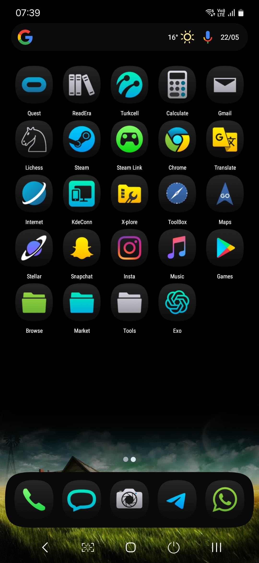
Here is how my phone looks now:
Except for Apple, almost all other brands have poor designs for UI’s rounded areas, their gaps, and margins. After a while, I started ignoring these imperfections.
It took some time for me to design icons for my most-used apps. Here is an example of how I designed them:

However, making an icon pack is hard. What about the new apps you install? Or other common apps?
Total of 18178 icons for coverage!
My icon pack has a total of \(18,178\) icons. \(1,600\) of those are handmade/handpicked, with some having multiple copies for common Android apps. For example, every Android brand has its own camera app, and all should have the same camera icon. The same goes for the Photo Gallery, Phone, and Messages apps, etc.
I have an icon mask archive from my old Veniverse icon pack. I used those mask files with custom gradient .png files to bulk-generate all non-hand-designed icons. I used a similar approach for this “Nokiaics” theme too:
This was the easy part for me. I have differently \( \rm \color{#ff00ff}{c}\color{#8d8d00}{o}\color{#aa00ff}{l}\color{#2759ff}{o}\color{#aa0000}{u}\color{#00a7a7}{r}\color{#ff5500}{e}\color{#00aa00}{d}\) gradients and \(18,080\) black icon masks. My icon generation code iterates through all of them and skips icon generation if a handmade/handpicked one exists.
Apart from the themed (generated or hand-designed) icons, the standard background design for unthemed icons was tricky.
Icon Coverage Headaches
Non-covered icons for icon themes or unsupported icons for an OS’s default icon generation procedures can look extremely nonconformist:
Even Apple’s iOS dark icons don’t fully cover every app 🙃 From the beginning, iOS used non-transparent images for app icons, rounding them nicely on the home screen. This design choice ensured a consistent and cohesive appearance across all app icons, aligning with the overall aesthetic of iOS.
Since Android 7, Google designers also started disliking legacy.png icons with transparent backgrounds. This forced Android OEMs to adopt default background styles for a more uniform look in menus. For example, Samsung uses squircles, Oppo prefers rounded squares, and Google Pixel opts for circles by default.
However, the dark mode requirement for icons brings us back to using transparent .png icons or even vector-based, color-adaptable ones 😁 As an app developer, if you want your icon to integrate with the themed style shown in the Google Pixel screenshot above, you’ll need to provide a single-color, background-free icon. This allows the system to adapt your icon to the user’s foreground and background color selections.
Generic Icon plates
Before fully customizable icons became a trend, icon packs used the “icon plate” technique to theme unthemed icons. For example, take a look at this theme, and here’s a preview:
The icon plate technique works like this:
While this approach isn’t perfect for every icon, it still looks better than the inconsistent icons seen on the Pixel device above. For this method to be effective, all other icons must share the same plate, which should remain in 2D.
My Tricky 3D Solution
My nostalgic Nokiaics theme, however, is a 3D icon theme. Applying an app’s default icon, scaling, masking, and placing it on top of a plate doesn’t work because my Android launcher (home screen) automatically handles scaling and layering onto the icon plate.
But I found a solution 😁 I designed a unique icon plate that represents a default 2D app icon in 3D, with the center left empty for the app icon 😎
Was It Worth Two Weeks?
Absolutely. If it wasn’t, I wouldn’t have done it. I enjoyed every bit. I even enjoy a quick icon design when writing a new post, like this post’s icon on the top left, following you while you scroll down 🙃 That is why I built my blog theme around it, so I can design new icons whenever I’m writing a post.
Theming, designing, and drawing are hobbies of mine. I developed utilities and tools for the Veniverse icon pack because I grew tired of trying other people’s icon themes.
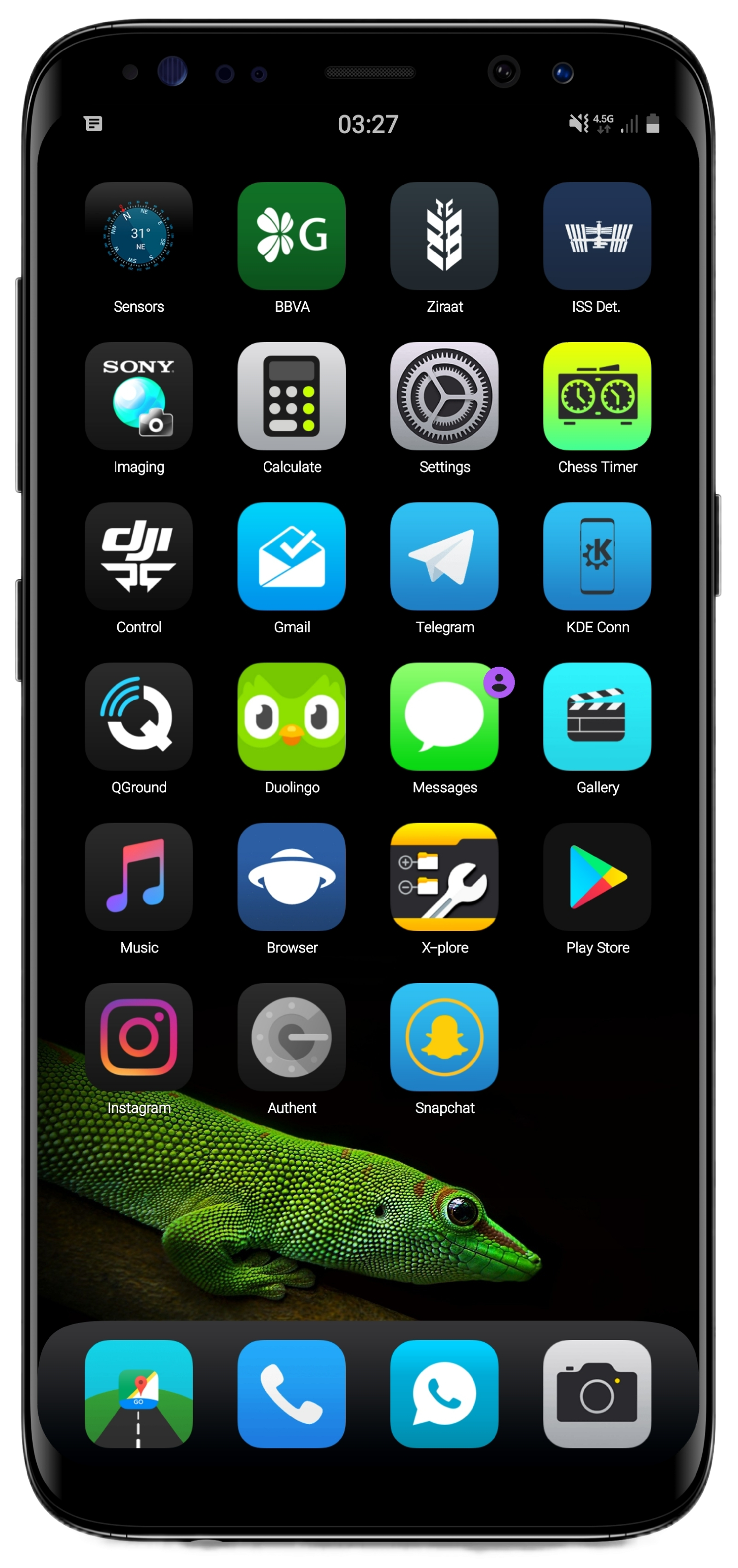
Here’s how my old phone looked before Veniverse:
And here are some setups I tested and compared: